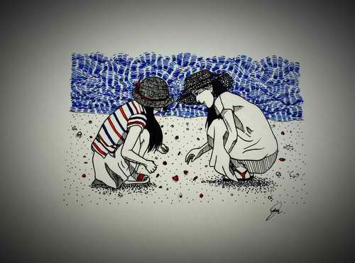
Home  | Login  | Register  | Help  | Play 

Treasured Memoirs

 
Logged in as: Guest
  Printable Version
All Forums >> [Gaming Community] >> [Legends and Lore] >> Artists of Legend >> Treasured Memoirs
Forum Login
Message << Older Topic   Newer Topic >>
4/12/2015 8:13:31   
bruextian
How We Roll Winner
Aug14


After many years of slumber. I finally got the strength and the passion to enlighten you guys once more.
I confess that I have been inactive this past few years showcasing mg arts and progress. There might have been a long silence but I didn't just stand idle.
I honed my skills, tried different art genre, different art medium, met skilled artists and made art with them. My journey was intense and harsh.
It was a fierce battle. If I don't have precious comrades to lift me every time I feel failure, I might have lost sight of what I treasure most.


Traditional Arts 2015


Traditional Arts (2013-2014)


Digital Arts (2013-2014)


Gallery in Progress

< Message edited by bruextian -- 11/16/2016 4:38:01 >
AQW Epic  Post #: 1
4/24/2015 0:17:49   
Solar Boy
Vorpal Edges Biggest Fan!


Hey there! Falling water is pretty cool. The perspective seems a bit iffy here and there, but the architectural bits and the foliage look really nice! :D
AQ AQW  Post #: 2
4/24/2015 11:17:57   
Wyrm
How We Roll Winner
Mar15


I'm going to jump in here and echo Solar Boy. The perspective on Falling Water could use a bit more tweaking I think the overall piece is very pretty. The subject matter is definitely beautiful and you captured the overall feel of the architecture nicely. My biggest problem with this piece is the overall values, or at least the values captured by your digital image. The whole piece looks very gray and bland. I can see that you have some nice darks and the sun/moon looks like it should be a nice white (at least if this was drawn on white paper) but the levels in your image are so out of balance that even your blacks look gray.

Don't sweat it though mate a LOT of my images have the same problem since I use a digital camera to take snaps rather than a scanner.

I also really like Shinobi Egg Hunt. There are a lot more perspective issues with this particular piece but I can easily overlook that thanks to the whimsical subject matter (it helps that I like Naruto) and the gorgeous hatching lines in the tree leaves.

Keep it up and...

Art On!
AQ DF MQ AQW  Post #: 3
5/12/2015 6:30:59   
bruextian
How We Roll Winner
Aug14


quote:

Hey there! Falling water is pretty cool. The perspective seems a bit iffy here and there, but the architectural bits and the foliage look really nice! :D

Yeah my worst enemy is perspective, having really hard time practicing it.

quote:

I'm going to jump in here and echo Solar Boy. The perspective on Falling Water could use a bit more tweaking I think the overall piece is very pretty. The subject matter is definitely beautiful and you captured the overall feel of the architecture nicely. My biggest problem with this piece is the overall values, or at least the values captured by your digital image. The whole piece looks very gray and bland. I can see that you have some nice darks and the sun/moon looks like it should be a nice white (at least if this was drawn on white paper) but the levels in your image are so out of balance that even your blacks look gray.

Don't sweat it though mate a LOT of my images have the same problem since I use a digital camera to take snaps rather than a scanner.

I also really like Shinobi Egg Hunt. There are a lot more perspective issues with this particular piece but I can easily overlook that thanks to the whimsical subject matter (it helps that I like Naruto) and the gorgeous hatching lines in the tree leaves.

Keep it up and...


Agree with the perspective. Due to my camera 5mp and the poor lighting in my kitchen, the piece became dim. The values are totally different RL. But I agree it being out of balance. I even had a hard time making different values using only one pencil (6B).
AQW Epic  Post #: 4
5/15/2015 1:18:02   
bruextian
How We Roll Winner
Aug14


I had a rest day from workout yesterday and decided to draw :). I only planned on doing sketches but ended up inking and coloring it haha.


< Message edited by bruextian -- 5/15/2015 21:16:04 >
AQW Epic  Post #: 5
5/15/2015 20:52:44   
bruextian
How We Roll Winner
Aug14


Lineart of the Angel I did. :)


< Message edited by bruextian -- 5/15/2015 21:03:25 >
AQW Epic  Post #: 6
5/15/2015 21:00:53   
bruextian
How We Roll Winner
Aug14


Akira
(Light)

A quick sketch and color of my original character.. Other info is still in progress :). Will post it soon.


AQW Epic  Post #: 7
5/15/2015 21:06:51   
bruextian
How We Roll Winner
Aug14


My co artist, Miss K.I.M., is currently at my crib :) we decided to make some sribbles. :). Upper work is hers and the lower work is mine.


AQW Epic  Post #: 8
5/15/2015 21:10:24   
bruextian
How We Roll Winner
Aug14


More scribbles. Tried mimicking miss K.I.M.'S styke


AQW Epic  Post #: 9
5/19/2015 5:29:40   
bruextian
How We Roll Winner
Aug14


Right to be Peacefully Free
First time using oil pastel. It was a bit difficul using it. Don't know the basic mechanics of this media. But I'm sure to practice it.


AQW Epic  Post #: 10
5/19/2015 14:41:06   
Wyrm
How We Roll Winner
Mar15


Loving all the new updates! Pass on my compliments to Miss. K.I.M. as her sketch is wonderful. I really like the Akira piece it has a nice solid look to the lines and it real tangible feel to it if that makes sense. Your colouring and shading is great on Akira as well.

Never used oil pastels meself but I love all the vivid colours you jammed into Right to be Peacefully Free. The only bit that seems rushed or out of place are the little swirls between the two groups of figures. They don't seem like they're a part of the whole but something tacked on later. Not a bad thing I just think you could have put a little more time into their design or placement and it would have flowed better. 2 thumbs way up for that fist though, it's killer!

Art On!
AQ DF MQ AQW  Post #: 11
5/20/2015 0:34:32   
bruextian
How We Roll Winner
Aug14


quote:

Loving all the new updates! Pass on my compliments to Miss. K.I.M. as her sketch is wonderful. I really like the Akira piece it has a nice solid look to the lines and it real tangible feel to it if that makes sense. Your colouring and shading is great on Akira as well.

Never used oil pastels meself but I love all the vivid colours you jammed into Right to be Peacefully Free. The only bit that seems rushed or out of place are the little swirls between the two groups of figures. They don't seem like they're a part of the whole but something tacked on later. Not a bad thing I just think you could have put a little more time into their design or placement and it would have flowed better. 2 thumbs way up for that fist though, it's killer!

Art On!


Thanks :). I was with Miss K.I.M. And she was glad that you liked it. She was sorry since her work was rushed and the hand is huge :).
I was quite surprised by my Akira work. I just combined soft and hard touch with very fine crosshatching shading. And the result was that.
I don't know why, but I really love colorful work. Is my way of thinking somehow screwed? Since I think my colors combinations were just fine in this one. And since you don't often see works with combinations of colors that seems incompatible.
Yes honestly I kinda rushed the swirls, and during my experimentation, I discovered this weird trick. If you put color red over color blue the result will be a very smooth and bright purple-ish color. So tried the other way around on the rigt side. But that law didn't work, the result was a very rough blue.
AQW Epic  Post #: 12
6/4/2015 13:10:16   
bruextian
How We Roll Winner
Aug14


Beng Beng

A quick portrait of my new friend "Jana". A beautiful and active girl. Her vigour motivates me. So pure yet fragile. Lately, she's been feeling nothing but pain. So I gave this as a small gift to her. To help her smile again.


AQW Epic  Post #: 13
6/9/2015 17:54:42   
Wyrm
How We Roll Winner
Mar15


Beng Beng: A very nice sentiment to go along with a nice drawing. I like the use of a bright monochrome. Some of the proportions seem a bit off though. her hand for instance looks a little small compared to the overall size of the face. Unless of course she has very petite hands, in which case disregard this comment lol.

AQ DF MQ AQW  Post #: 14
8/3/2015 18:27:02   
bruextian
How We Roll Winner
Aug14


I'm just lucky that I have that obe color pencil in my backpack. To be honest, I myself love the use of this monochromatic style. I admit some parts a bit of :) the eyes are small yayks haha.
AQW Epic  Post #: 15
8/3/2015 18:34:01   
bruextian
How We Roll Winner
Aug14


I quick portrait of my friend/ classmate. My friend went to our house and we decided to have a drawing match. :)


< Message edited by bruextian -- 8/3/2015 18:39:21 >
AQW Epic  Post #: 16
8/3/2015 18:42:16   
bruextian
How We Roll Winner
Aug14


A two hour portrait of Jesus Christ. This is our last plate for drafting class this semester :)


AQW Epic  Post #: 17
11/15/2016 23:32:40   
bruextian
How We Roll Winner
Aug14


"Passage of time"

This is our art piece for Guhit Pinas: Bataan, 2016 District Clash. A local competition here in my place. My team is consists of 4 members and we were given 2 hours to make a painting with the theme "Progress thru Art".


Attachment (1)

< Message edited by bruextian -- 11/16/2016 4:09:46 >
AQW Epic  Post #: 18
11/16/2016 4:08:20   
bruextian
How We Roll Winner
Aug14


"Collect"

Inktober entry day 3.

Medium:
Uni pin
Uni ball eye

Procedure:

1. I searched some rereferrence in the internet.
2. I started to draw the initial sketch with a hard pencil (F, H, HB, B). Hard pencil can be easily erased and won't leave some drawing marks.
3. I inked the outline with unipin except the colored background. I used different ballpoint sizes to have line variety.

Side note:
I inked the sea background with uni ball eye blue. I experimented and tried the Van Gogh strokes. Hope it turned out great


Tips:
*Be 100% sure that you're contented with your outline before inking.
*Draw the outline very lightly to avoid leaving any unwanted marks.
*Before inking, be mentally prepared. It will surely be stressful if you ever make a mistake in the inking processp.
*Enjoy your passion.


Art On!


Attachment (1)

< Message edited by bruextian -- 11/16/2016 4:43:18 >
AQW Epic  Post #: 19
11/16/2016 4:12:04   
bruextian
How We Roll Winner
Aug14


"Sad"

Inktober entry day 4.

Medium:
Uni pin
Uni Ball Eye

Procedure:

1. I searched some rereferrence in the internet.
2. I started to draw the initial sketch with a hard pencil (F, H, HB, B). Hard pencil can be easily erased and won't leave some drawing marks.
3. I inked the outline with unipin except the colored background. I used different ballpoint sizes to have line variety.

Tips:
*Be 100% sure that you're contented with your outline before inking.
*Draw the outline very lightly to avoid leaving any unwanted marks.
*Before inking, be mentally prepared. It will surely be stressful if you ever make a mistake in the inking processp.
*Enjoy your passion.


Art On!


Attachment (1)

< Message edited by bruextian -- 11/16/2016 4:45:46 >
AQW Epic  Post #: 20
Page:   [1]
All Forums >> [Gaming Community] >> [Legends and Lore] >> Artists of Legend >> Treasured Memoirs
Jump to:


Advertisement


Icon Legend
New Messages No New Messages
Hot Topic w/ New Messages Hot Topic w/o New Messages
Locked w/ New Messages Locked w/o New Messages
 Post New Thread
 Reply to Message
 Post New Poll
 Submit Vote
 Delete My Own Post
 Delete My Own Thread
 Rate Posts


Forum Content Copyright © 2018 Artix Entertainment, LLC.

"AdventureQuest", "DragonFable", "MechQuest", "EpicDuel", "BattleOn.com", "AdventureQuest Worlds", "Artix Entertainment"
and all game character names are either trademarks or registered trademarks of Artix Entertainment, LLC. All rights are reserved.
PRIVACY POLICY


Forum Software © ASPPlayground.NET Advanced Edition